Pack It
Tools Used
Optimal Workshop
Figma
Whimsical
Excalidraw
Maze
Role
UX/UI Designer
Duration
6 weeks
Type
end to end application
Goal
Minimize packing errors and improve the overall packing experiences for travelers.
Overview
The Problem:
Traveling comes with all sorts of anxiety inducing tasks before you can get to relaxing on your well planned out vacation. Why should packing be another challenging task! The focus of this project is on organizing packing for travelers who don’t want to spend too much time thinking about if they’ve forgotten something or not.
The Solution:
Pack It is a travel packing application that focuses on customizing a travel packing list dependent on user travel destinations.
Research
Objectives
Understanding what are the user pain points in the process of travel packing.
Identify user needs associated with travel packing.
Understand the current methods users are engaging in for travel packing.
Competitive Analysis
I explored four travel packing apps that were either available to IOS users or Android users. The following were most common for a travel packing app.
Integration with TripIt and being able to share your packing list with others.
Clean interface and easy navigation of the packing app.
Well organized categories and customization of created lists.
Offering of a free version for users and premium version.
Screener Survey & User Interviews
After desk research and analyzing my findings on the competitor analysis. I moved onto a screener survey to get more information on how users were packing. I needed more information so I did user interviews to find the challenges users were having with packing and how a packing app could help them.
Participants: users who have not used a packing app.
Number of Participants: 10 (5 survey , 5 interviews)
Key Quotes from User Interviews
user interview input on the challenges users face while packing and why they don’t use packing apps.
The Findings
Used affinity mapping to analyze user survey and interview findings to gather and organize patterns to create a solution.
Majority of participants most wanted features focused on weather forecasting, suggested lists, and reminder pop ups.
Define
How Might We’s
How might we create a travel packing app more appealing to users that haven’t considered using one before?
How might we encourage users to leverage a packing app versus a manual checklist ?
How might we make a travel packing application that assists users in packing efficiently while still giving freedom like manual packing checklists ?
User Persona
Ideation
Compiling the findings from the affinity mapping, I was able to come up with a user persona profile that represented the user group.
User/Task Flows
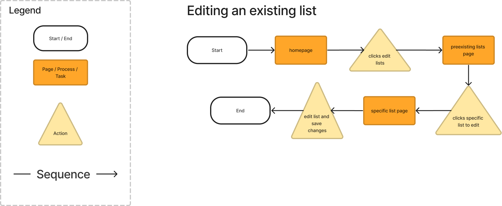
User and Task flows shown are user wants to create a new packing list trip and editing an existing list. To view more user and task flows visit the link below.
Low fidelity sketches were made to follow the user and task flows. I used a sketching app (Excalidraw) to help organize and create sketches that were clean and straightforward.
Low Fidelity Sketches
Main features that were prioritized for the key screens.
Destination search
Single or multi-destination options
categories and activities
Mid-Fidelity Wireframes
The digitized mid-fidelity wireframes.
Design
Logo Design
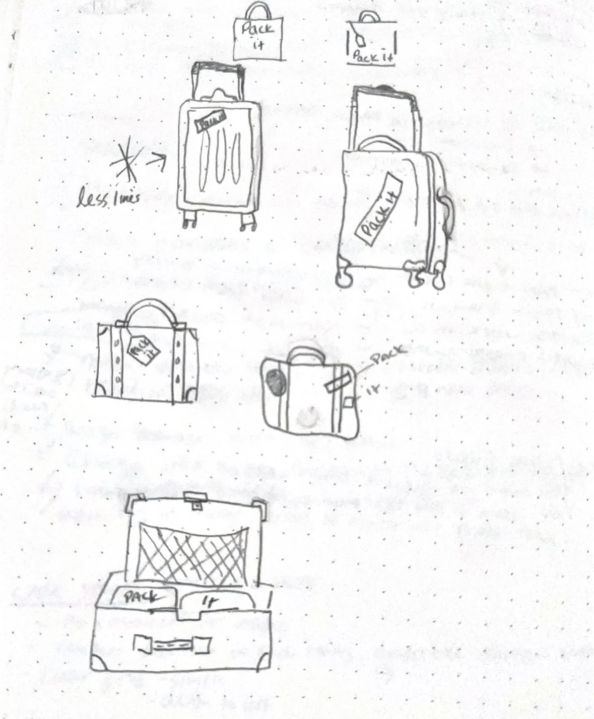
Logo Sketches
While deciding what to come up with for the Pack It logo. I spent time sketching with pencil and paper to try out different ways I could play around with a suitcase design. I wanted the design to be playful yet readable.
Digitized Logos
I chose to digitized and work on the roller suitcase sketch as it was a more modern travel bag widely used. I chose the first suitcase as it was more realistic and started to play around with different primary style colors for the coloring of the suitcase. I ended up choosing the green suitcase as I felt it was playful yet simple.
Style Tile and UI Kit
For Pack It’s style tile, I wanted to make sure that it was playful yet calming as packing is already stressful. The color palette lends to the calming goals that I thought were necessary. The color palette is split complementary. Primary color being blue, the secondary colors being a light green and muted yellow. The neutral tones being shades of white, gray, and a dark blue. The typography I wanted to be readable and to the point. I decided on the sans serif font Roboto for its readability and curvedness.
Prototyping and Testing
Prototype
A prototype was made in figma for conducting usability testing. The prototype is following the task flows of creating a new trip, managing notification settings, editing an existing list and sharing a list.
Usability Testing
7 participants
1 moderated , 6 unmoderated testing over the Maze platform.
Key Points
Participants found the tasks to be somewhat difficult to complete
Maze had some prototype issues where participants could not finish certain tasks.
The main takeaways were more text information for users who have not used a packing app to understand how to use one, the notification tab being more clear on what is being asked, the calendar being a drag type instead of individual clicking type, and some UI issues with menu and the prototype.
Iteration
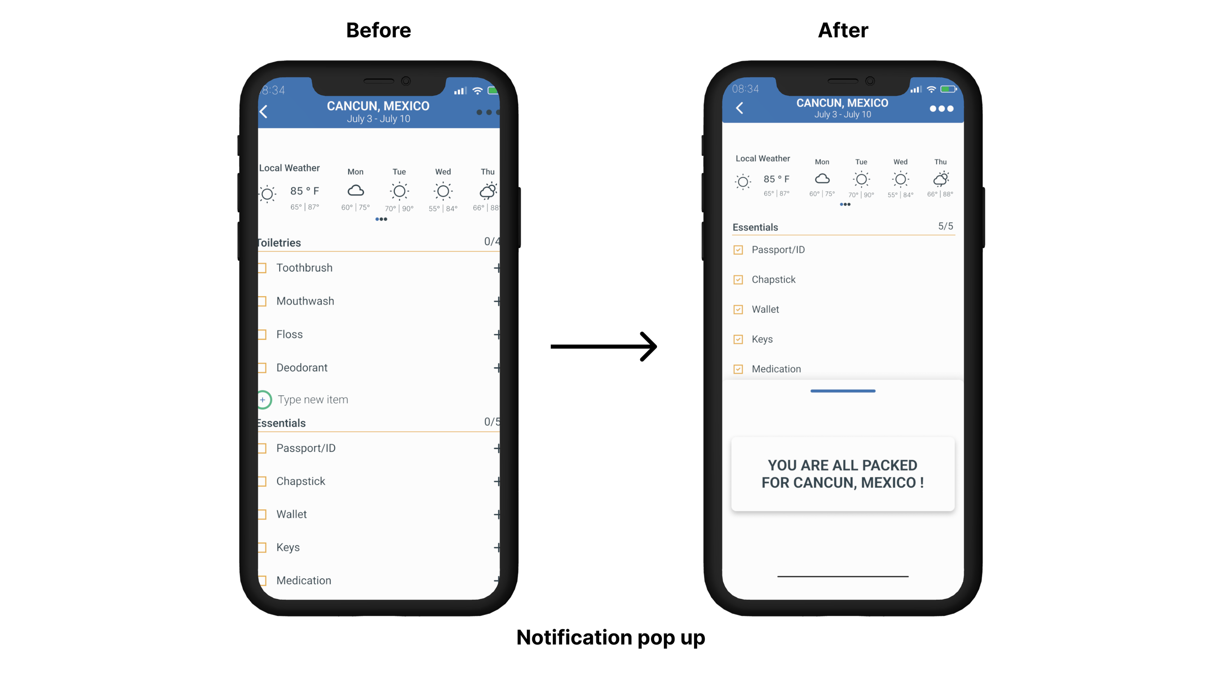
Iterations were made based on usability testing results.
Changes navigation menus
changes to the UI on the customized list, the more button being more prominent.
adding a notification pop-up when users were finished with their packing to show progress.
UI details made more cohesive for a well rounded appealing platform.
Calendar UI changed to be more intuitive.
Final Prototype
Conclusion
Pack it being my first dive into an end to end mobile application product, I found more insight into what goes into creating digital products from start to finish. Pack It is a product for users who are traveling and want to organize their packing items by their destination. For the next steps of Pack It, I would focus on additional features like creating a way for users to view their outfits or helpful hints on what to pack.


